Timeframes and Bar Types Explained: Time, Tick, Range and Volume Bars
Every chart replaces the x-axis with something: the clock, the number of trades, the contracts traded or the distance price moved. That choice decides what you see and what disappears. The four bar types from zero, the same hour on all of them, and how to choose.
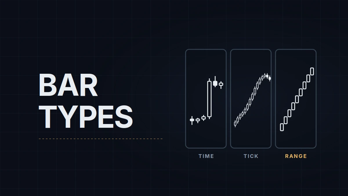
The same hour of trading, drawn three ways, looks like three different markets. On a 5-minute chart it is twelve bars, two of them tall. On a 2,000-tick chart those two bars become eight, and the quiet half-hour before them shrinks to two. On a range chart the move is a staircase and the chop around it nearly vanishes. Nothing about the trades changed, only the rule for when a bar closes.
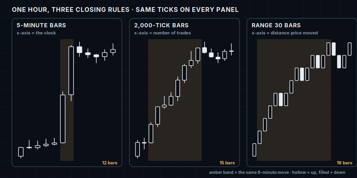
A bar is a container with a closing rule, and the rule decides most of what you see. How to read a price chart covers what's inside the container, the open, high, low and close; this post is about what decides where one container ends and the next begins. There are four common rules, and each one puts a different quantity on the horizontal axis.
Time bars: the x-axis is the clock
A 5-minute bar closes every five minutes, whether one contract traded or ten thousand. The horizontal axis is time, and that is both the strength and the blind spot. You can see the session on the chart: the open, the lunch lull, the close are all where they belong, and a bar at 9:35 AM ET is directly comparable to yesterday's 9:35 bar. Every other trader's chart is built the same way, so a level or a pattern you describe is the same thing on their screen.
What time bars hide is pace. A dead overnight bar and a frantic bar at the cash open are the same width. The two tall bars in the figure contain more trades than the ten bars around them combined, and nothing in their shape says so. Time bars also blur fast moves: a 30-point swing that took ninety seconds gets one candle with a long wick, and the sequence inside it is gone.
Tick bars: the x-axis is activity
A 2,000-tick bar closes after 2,000 trades. When the market is busy, bars come every few seconds; when it is dead, one bar can take ten minutes. The axis is activity, so a fast move gets unpacked into many bars while a slow drift gets compressed into few, which is exactly the opposite of a time chart. That is why tick charts are popular for execution: the moment that matters has resolution and the hours that don't are short.
What they hide is time itself. Two adjacent bars can be four seconds apart or four minutes, and the session structure disappears unless the platform draws a session boundary ("Break at EOD" in NinjaTrader, covered in chart setup). One more thing to know before comparing tick charts with anyone: a "tick" is a reported trade, and data feeds report trades differently. One feed may bundle a 50-lot into one tick where another reports it as several fills, so a 2,000-tick chart on two feeds is not the same chart. The shape is the same; the bar boundaries are not.
Volume bars: the x-axis is size
A volume bar closes after a set number of contracts have traded, 5,000 for instance. It is the tick bar's heavier cousin: fifty one-lots and one fifty-lot both count as fifty contracts, so bars close on participation rather than on the number of prints. In busy markets volume and tick bars look alike; the difference shows when a handful of large orders go through, which finishes a volume bar in seconds while a tick bar barely moves.
They hide the same things tick bars hide, time and session structure, and they add a dependency on volume data being complete for the contract you're on, which matters around a contract roll.
Range bars: the x-axis is distance
A range bar closes when price has covered a fixed height, 30 ticks for example, and a new bar opens where the last one closed. Every bar is the same size. The axis is price movement: a trend prints a clean staircase of bars in one direction, and a consolidation of the same duration prints almost nothing, because price isn't covering distance. Neither time nor volume is on the chart.
Range bars are the most different-looking of the four, and the differences are structural. There are no wicks beyond the bar's range, so candle patterns built on wicks don't exist here. There is no such thing as a "big bar" or a "small bar", so patterns built on bar size, an engulfing bar, an inside bar, are impossible by construction. What they give in return is a stop distance you can see: with 30-tick bars, a stop two bars away is always 60 ticks, on any day, at any hour. Renko bars are a cousin with the same idea and a synthetic open, and they hide even more of the path.
Which one, for what
Practitioners split along a fairly clean line. Time bars for structure and for anything you'll compare with other people: swing highs and lows, session levels, the higher-timeframe picture. The 15-minute and hourly charts most level traders mark before the session are time charts because a prior-day high is a prior-day high on everyone's screen.
Activity-based or range bars for execution, where the question is how price behaves at one level over a few minutes and resolution matters more than comparability. Tick charts keep the pace visible; range bars keep the stop visible. Some traders run a small time chart for execution instead and accept the blur; it's a legitimate choice, and its cost is that fast moves at the open compress into single bars.
The mistake that costs money is carrying a reading across bar types. A wick means rejection on a time chart, and a range chart can print one only within a single bar's fixed range. A cluster of small bars means indecision on a time chart, and on a tick chart it means the market is busy, which is close to the opposite. An indicator tuned on one bar type, a moving average length, a volatility band, describes a different thing on another. Learn one bar type well enough to know what it hides, and when you change it, relearn.
I execute on a range chart and read context on a larger tick chart, with structure marked from time charts in preparation; the bare-chart layout in the chart-setup post is exactly that. The range chart is there for one reason: the stop is a visible number of bars, and I want that number in front of me rather than in a field.
Educational content, not investment advice. Futures trading involves substantial risk of loss. Examples are for illustration only. Read the full Risk Disclosure.