Bookmap for NQ: What a Heatmap Shows That a Chart Doesn't (and What It Doesn't)
A price chart records trades. A heatmap records the orders that were waiting, the ones that got pulled, and the ones that absorbed 400 contracts without moving price. What Bookmap adds to an NQ level, where it misleads, and what a full-depth setup costs at the time of writing.
A price chart records what traded. It cannot record the 600 contracts that sat two ticks above a level for forty minutes, the second in which they disappeared, or the 400 that were sold into a bid that never moved. Those things happen in the order book, and on a normal NinjaTrader chart the book is invisible. Bookmap is a separate program whose whole purpose is to draw the book, and to keep drawing it so the history stays on screen. For a trader working the E-mini Nasdaq-100 from a list of levels, that history answers a question the chart can't: is anyone defending this price.
What the picture is made of
The heatmap is a grid. Time runs left to right, price runs bottom to top, and every cell is colored by how many contracts were resting at that price at that moment. Bids sit below the market, asks above; the brighter the band, the bigger the size, on a scale set by two cutoffs in the heatmap settings. Because the display scrolls instead of repainting, a wall that has been in the book since the European open shows up as a long bright stripe, and a wall that was placed ten seconds ago as a short one.
On top of the grid sit the trades. Bookmap draws them as dots whose diameter is the volume executed at that price during the interval, with the colors telling you whether the aggressor was buying at the ask or selling at the bid. The best bid and best ask are drawn as two lines with a gap between them, which is the spread. Everything a depth-of-market ladder shows, the heatmap shows too, with the difference that the ladder shows one moment and the heatmap shows the last hour.
Two feed details matter. The standard CME depth feed carries ten price levels on each side of the market, so the grid is bright for about two and a half points around price and dim beyond it; Bookmap keeps the last size it saw at deeper prices until they come back into range. The market-by-order feed, sold separately by Rithmic and by Bookmap's own data service, carries every individual order rather than the total at each price, which is what the iceberg and stop-run indicators need.
Three things it shows that a chart can't
Whether a level has anything behind it. A key level is a price where you expect a reaction. On the chart it is a line. On the heatmap it is either a bright band of resting orders or nothing, and those are two different trades. Yesterday's value area high with 700 contracts stacked a tick above it is a place where sellers have committed size; the same line with a dim book behind it is a place where price can travel through without anyone stopping it.
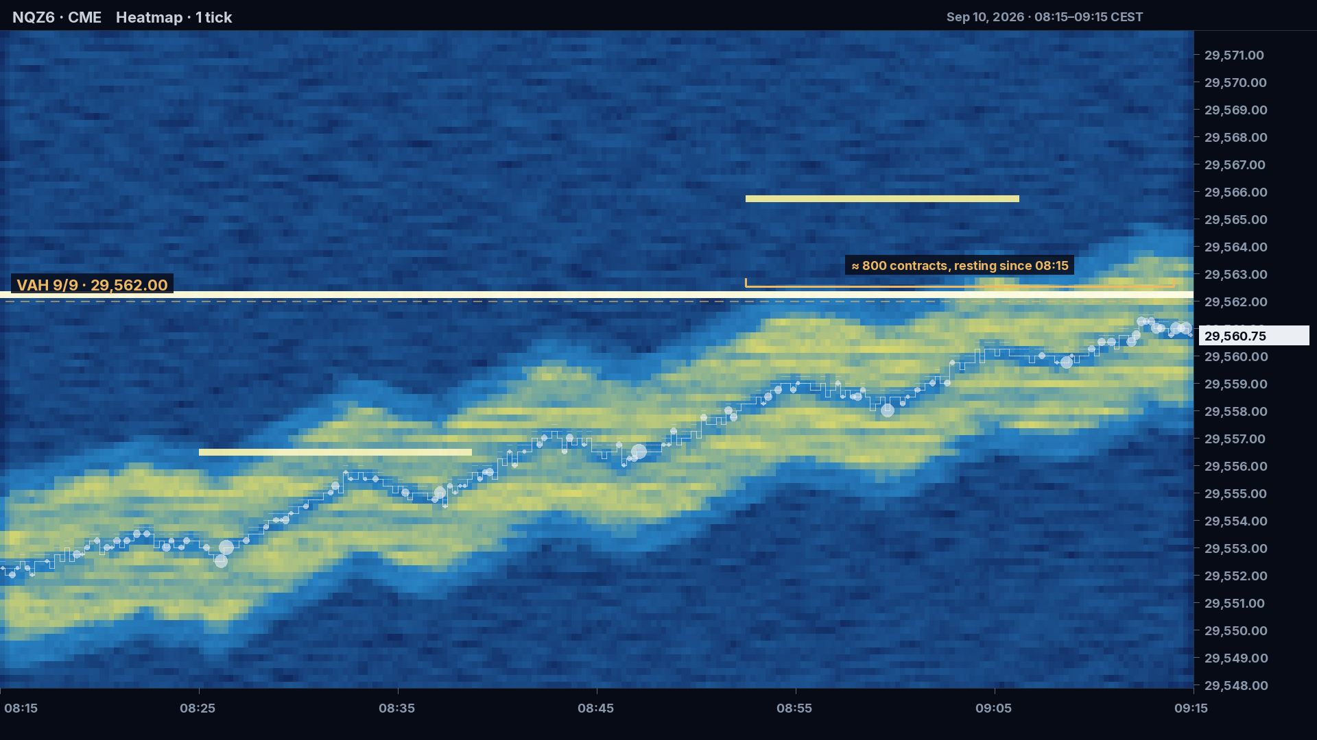
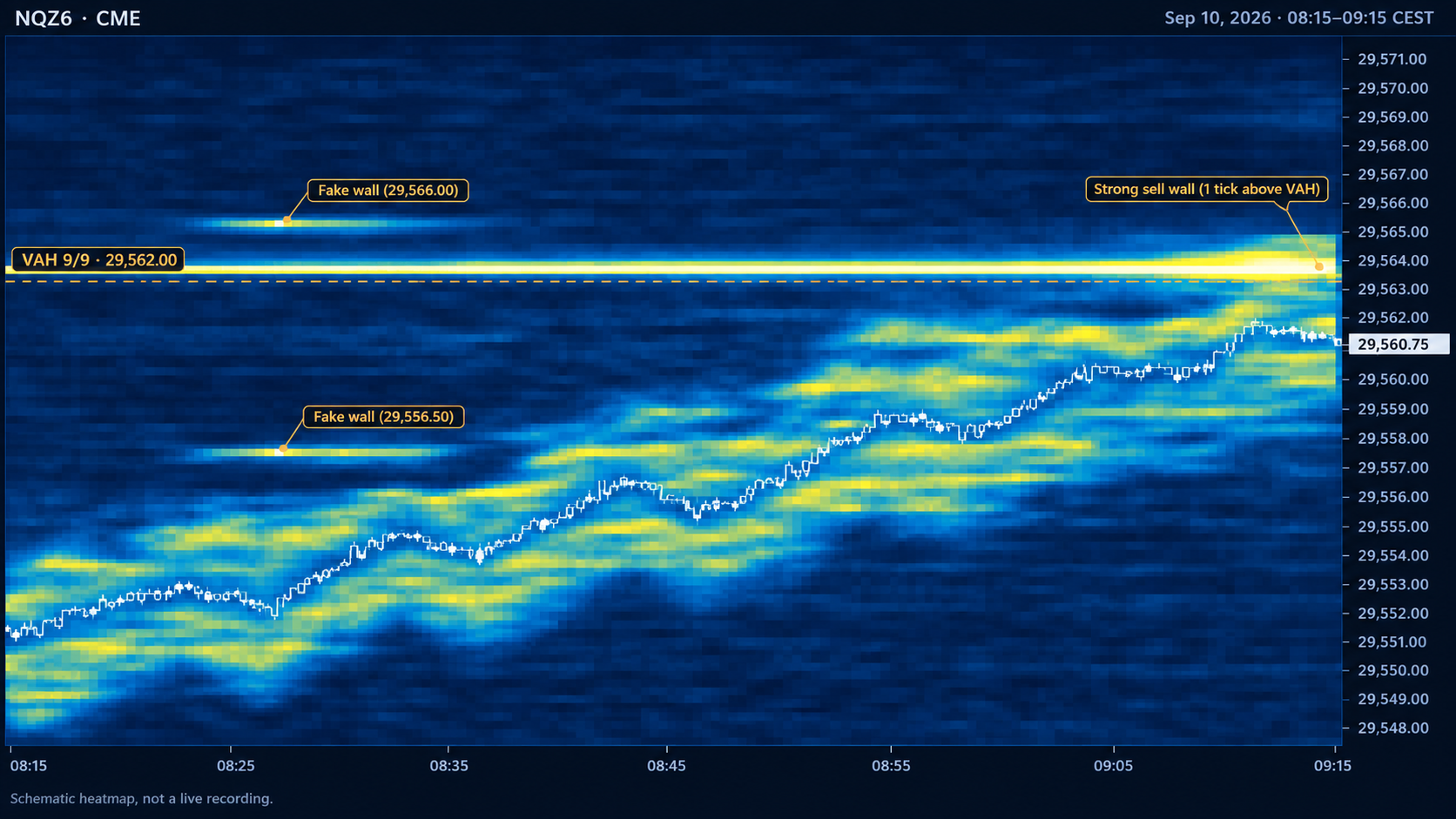
Liquidity that moves. Resting orders are not fixed. A wall that steps back a tick at a time as price approaches is being withdrawn, not defended, and price usually follows it. A wall that gets bigger as price gets closer is the opposite. Size that appears from nowhere on the far side of the market right before a move often turns out to have been a decoy, pulled the moment price turned. None of this is visible after the fact on a chart, because none of it traded.
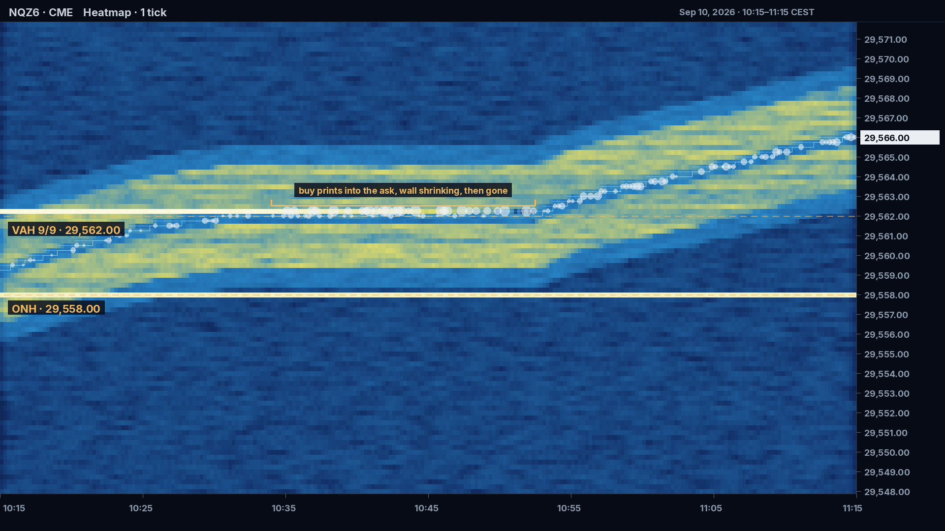
Absorption. This is the one a reversal trader cares about most. Large sell dots printing at the bid, one after another, while the bid does not shrink and price does not tick down: aggressive sellers are being absorbed by a passive buyer who keeps refilling. It looks like nothing is happening. What is happening is that the side you expected to hold the level is holding it, in real time, and the sellers are running out. The mirror image is a wall being eaten: dots into the ask, ask size shrinking with each print, then gone. That is the level failing before the chart has closed a bar.
What it does not show
It does not show intent. A 500-lot in the book is not a promise to buy; it can be cancelled in a millisecond, and cancelling before it is touched is legal. The heatmap shows what was on the book, not why, and a trader who treats every wall as a commitment will get walked into moves the wall was placed to create.
It does not show stops. A stop order is not a resting order on the book. It is held by the exchange or the broker and becomes a market order only when its price trades, so the cluster of stops above a swing high that everyone talks about is invisible on the heatmap until it fires. What you see then is a burst of dots and an empty book, which is the effect, not the location.
It does not show the rest of the market. NQ moves are routinely started in ES, in the cash index, in QQQ, or in the options book, and none of those are in an NQ heatmap. A wall on NQ can be run through by flow that never touched NQ's book until it was already moving.
And it does not replace the level. Absorption at a random price in the middle of a range is noise. The heatmap earns its screen space at prices where you already had a reason to expect a reaction, which is why the level list comes first and the heatmap second.
What it costs, at the time of writing
Bookmap's own subscription and the market data are billed separately, and the futures heatmap needs both.
| Plan | Monthly | Yearly (per month) | Lifetime | Real-time NQ |
|---|---|---|---|---|
| Digital | free | — | — | no, delayed only |
| Digital+ | $19 | $16 | — | no |
| Global | $49 | $39 | $990 | yes, plus data |
| Global+ | $99 | $79 | $1,990 | yes, plus data |
Data for CME is $34 a month per exchange from BookmapData (a $79 bundle covers CME, CBOT, NYMEX and COMEX), $37 a month per exchange from dxFeed, or $40 to $101 a month through Rithmic depending on the package. The cheapest full-depth NQ heatmap is therefore Global plus one CME feed, $83 a month billed monthly or $73 on the annual plan, before any add-ons. A Tradovate login, the one behind a Lucid or similar prop account, can be connected for order routing and supplies only partial depth, so it does not fill the heatmap on its own. All of these figures are from Bookmap's pricing pages in September 2026 and change.
Who it is for, and who it isn't
Traders who get the most out of it are the ones who already trade from levels and want to know, at the level, whether the other side is showing up. Scalpers who work the ladder use it as a ladder with memory. Traders who run a time-based or indicator-based system, where the entry is defined by the chart and not by the book, get a second screen full of information their rules don't use, and the information tends to leak into decisions anyway. Anyone on a first evaluation who is still learning to execute the plan they have is usually better served by fewer inputs, not more.
The alternatives are cheaper and narrower. NinjaTrader's SuperDOM shows the same ten levels live, with no history, for free. Order Flow+ inside NinjaTrader gives footprint bars and a volume profile, which are trade data, not book data. What none of them draw is the book over time, and that is the only thing Bookmap does that the chart doesn't.
I run it on NQ as a standalone window next to a bare NinjaTrader chart, and it answers two questions and nothing else: is there size at the level, and is that size absorbing or being eaten. It has never talked me into a trade. It has talked me out of several, at levels that turned out to have nobody home.
Educational content, not investment advice. Futures trading involves substantial risk of loss. Examples are for illustration only. Read the full Risk Disclosure.